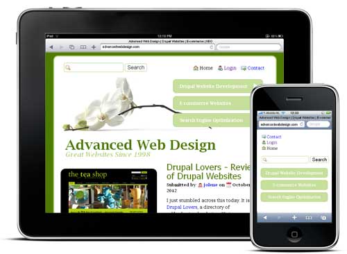
Responsive web design is the approach where your website (ie. your Drupal theme) is designed in such a way that it alters its design and layout to accommodate viewing on different devices. For example, the design may include a large background image when viewed on a full size computer, but that image is dropped, it responds, when viewing it on a tablet device or smartphone.
When Should a Responsive Theme Be Used?
Especially for a website which expects to have a varied visitor base, this design method becomes very important. A photographer may not expect folks to view photo galleries on a smartphone, but a municipality should count on citizens looking for quick information on that same device.
What Kinds of Changes will be Made to the Design on Different Devices?
Anything that increases the usability or readability of a website in a particular design should be considered. Adjustments may include:
- Dropping background image or color
- Changing font or pictures sizes
- Switching from three columns to two column or even a one column design
- Hiding non-essential features such as a slideshow or search bar
How Does This Work?
Anywhere from three to seven different designs need to be created. They may be very similar or quite different depending on the look and functionality you are looking to achieve. Then one of these different designs, the most appropriate one, is used depending on what device or screen size is detected. As you can imagine, this takes a lot more work on the web designer's part!
Do I Need a Responsive Theme for my Website?
If you are unsure, you may find it helpful to discuss your target audience and current typical visitors with a professional who creates responsive designs. Helpful information may come from industry statistics, searches engines, or your website logs. We design responsive themes! Contact us for a consultation.